Text Tools
Why Is ASCII Art Misaligned?
Diagnose ASCII art with four checks—font, whitespace, width, and character cells—then choose a format the destination can preserve.
By Vigneshwaran Vijayakumar, Developer and Publisher | | Reviewed under the ClockTools editorial policy
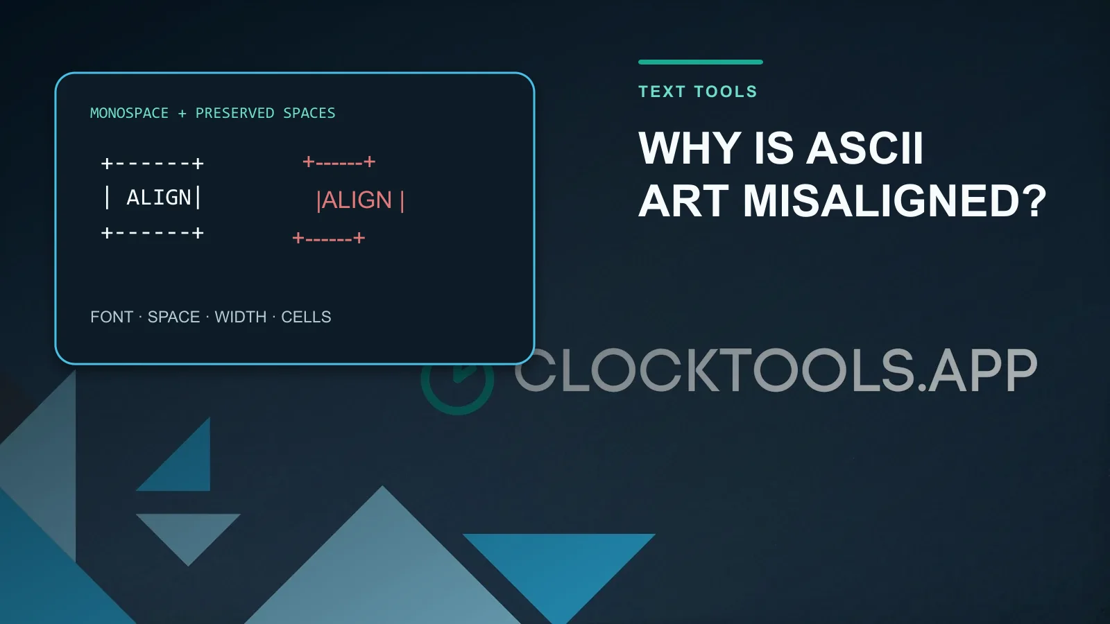
Table of contents
ASCII art usually becomes misaligned because the destination uses a proportional font, collapses repeated spaces, expands tabs differently, or wraps a line before the artwork ends. Fix the container first: use a fenced code block or a pre element, choose a monospace font, replace tabs with spaces, and keep every line within the destination's narrowest width. The ClockTools ASCII Art Generator shows live column, row, character, and byte counts so you can test the actual output before pasting it.
Which four checks find most alignment failures?
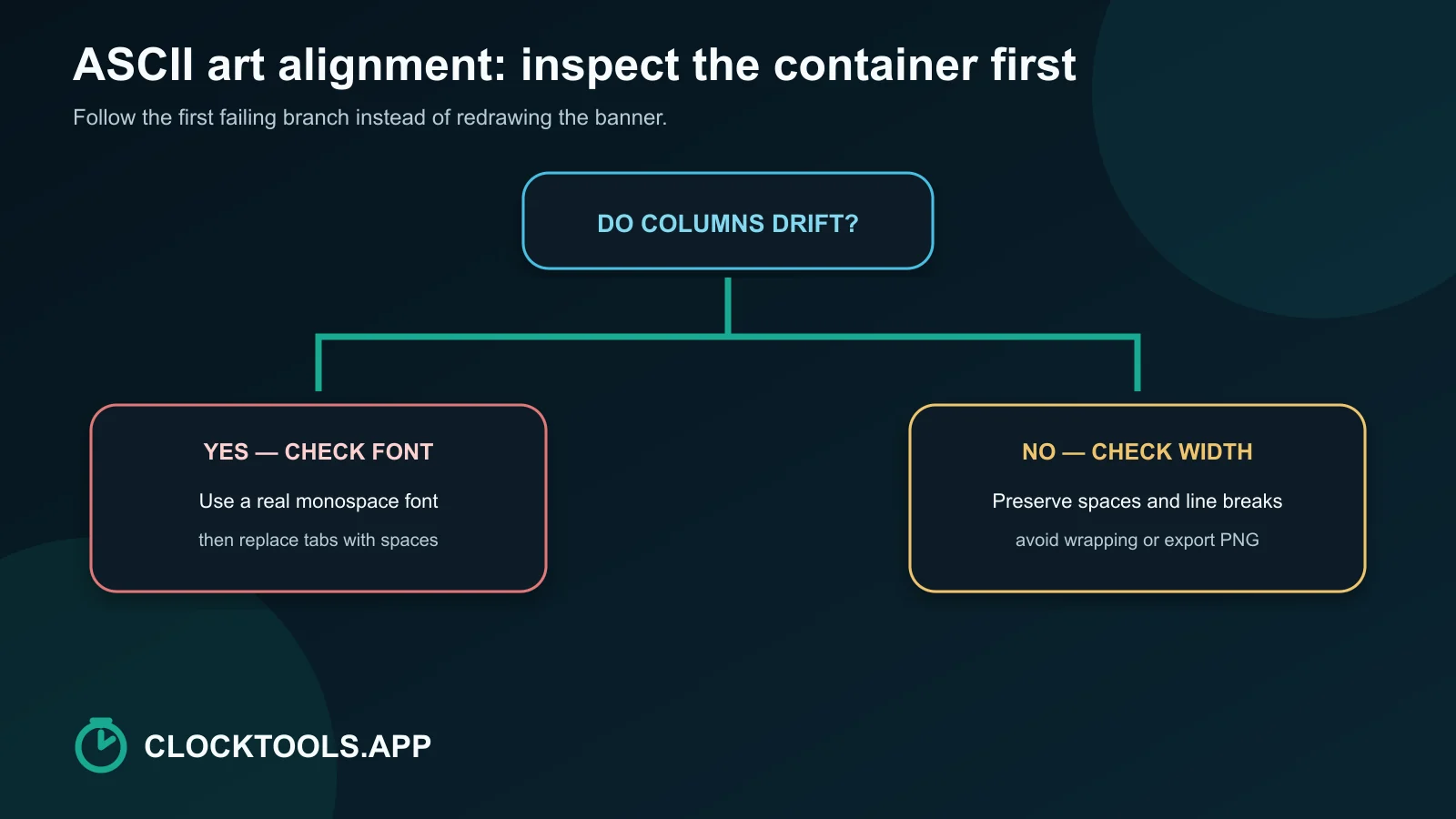
Use this order because each step rules out an entire failure class:
- Font: confirm that the destination renders the art in a monospace font.
- Whitespace: confirm that repeated spaces and line breaks are preserved.
- Width: find the longest row and compare it with the narrowest viewing container.
- Characters: look for tabs, wide Unicode symbols, emoji, or fallback glyphs that may occupy unexpected cells.
Do not start by redrawing individual letters. If every row drifts after the same point, the structure is probably intact and the renderer is changing the spacing.
| Symptom | Likely cause | Fast check |
|---|---|---|
| Columns drift gradually | Proportional font | Switch the same text to monospace |
| Leading indentation disappears | Collapsed spaces | Wrap the art in a preformatted block |
| One editor looks right and another does not | Tab width or font fallback | Replace tabs and inspect the font |
| Right edge drops to a new line | Container wrapping | Measure the longest row |
| Only rows with symbols move | Character-cell width | Replace wide or fallback glyphs |
Why does a proportional font break the picture?
ASCII art treats characters as tiles in a grid. A space, underscore, slash, and capital W must advance by the same cell width for vertical features to remain aligned. A proportional font deliberately assigns different widths, so a row containing narrow letters no longer occupies the same distance as a row with wide letters.
The CSS generic family monospace asks the browser for an equal-advance font. W3C's font guidance lists monospace as a generic family, while the CSS 2 definition describes a monospaced font by its fixed glyph width.
When you control the page, use a preformatted element and a monospace stack:
<pre class="ascii-art">YOUR ART HERE</pre>.ascii-art {
font-family: ui-monospace, "Cascadia Mono", Consolas, monospace;
white-space: pre;
overflow-x: auto;
}This preserves the drawing without forcing it to wrap. A horizontal scroll is often less damaging than a broken right edge.
How do spaces, tabs, and wrapping change the rows?
Normal HTML collapses runs of spaces and treats line breaks as flow whitespace. The CSS white-space property controls whether spaces, newlines, and wrapping are preserved. pre preserves all three structural ingredients of ordinary ASCII art: repeated spaces, explicit rows, and no automatic wrapping.
Tabs are not stable alignment units. One editor may use four columns, another eight, and a web component may apply a custom tab size. Replace each tab with the intended number of spaces before distribution.
Trailing spaces are fragile too. Some editors remove them on save, and review tools may hide them. Prefer a design whose meaningful right edge does not depend on invisible trailing padding. Leading and interior spaces are easier to preserve inside a preformatted container.
What changed in a controlled ClockTools test?
A live test on 2026-09-01 entered ALIGN in the Standard FIGlet font. With left alignment, the generator reported 31 columns, 6 rows, 159 characters, and 159 bytes. The visible output was:
     _    _     ___ ____ _   _
    / \  | |   |_ _/ ___| \ | |
   / _ \ | |    | | |  _|  \| |
  / ___ \| |___ | | |_| | |\  |
 /_/   \_\_____|___\____|_| \_|
Changing to a 40-column target and center alignment made leading padding part of the text. The reported result grew to 65 columns and 380 characters even though the letter shapes themselves had not changed. This is the critical observation: alignment can add literal spaces, so a banner that appears centered in the generator may become too wide for its destination.
The tool also separates preview color from the raw text and offers text-oriented TXT, Markdown, ANSI, and HTML exports plus PNG. That separation helps prevent a decorative preview setting from silently changing the characters you copy.
How should you paste ASCII art into Markdown or HTML?
On GitHub, wrap the text in a fenced code block. GitHub's documentation shows triple-backtick fences and recommends blank lines around them. Add the text label when you do not want a programming-language highlighter to color punctuation.
```text
YOUR ASCII ART
```
For a README, keep the project name as a normal heading before the art. Screen readers may announce every punctuation mark, and a decorative banner should not be the only place where essential wording appears.
In HTML, use pre rather than inserting a chain of non-breaking spaces. Test the narrow view. You can use the Real-Time HTML Editor to compare white-space: pre, pre-wrap, and normal flow without editing a production page.
When do Unicode characters create a width problem?
Strict ASCII characters are narrow, but many modern “ASCII art” designs use box-drawing characters, block shades, emoji, or other Unicode symbols. Unicode's East Asian Width report explains that characters may be narrow or wide in layout contexts, and ambiguous characters can depend on the environment.
Font fallback creates another variable. If the selected monospace font lacks one symbol, the browser may borrow it from a different font with different metrics. Test on the same terminal, chat app, or browser where the art will be consumed.
For the widest compatibility, choose a plain ASCII ramp such as @%#*+=-:. and avoid emoji. Use Unicode blocks only when the destination is known to render them consistently.
Which export should you use when text cannot stay aligned?
Choose the format for the destination, not for the generator preview:
| Destination | Best first choice | Why |
|---|---|---|
| README or Markdown comment | Fenced Markdown text | Preserves spaces and remains editable |
| Terminal or plain log | TXT with ASCII-only glyphs | Avoids markup and color assumptions |
| Color-capable terminal | ANSI | Carries terminal color codes intentionally |
| Controlled web page | HTML or pre-wrapped text | Lets you set font, whitespace, and overflow |
| Slides, social posts, proportional-text apps | PNG | Freezes the exact appearance |
Before export, paste the raw text into the Online Notepad to check for accidental tabs, and compare a before-and-after version with the Text Diff Checker. Character-level comparison exposes a deleted space that a visual scan may miss.
If the destination refuses monospace text, strips code fences, or wraps long lines, stop treating it as a reliable text canvas. Export a PNG, keep a normal text caption for accessibility, and preserve the original text separately for future edits.
Frequently Asked Questions
Why does ASCII art look different after I paste it?
The destination may use a proportional font, collapse repeated spaces, expand tabs differently, wrap long rows, or render some Unicode symbols at another cell width.
Which font should I use for ASCII art?
Use a true monospace font so every character advances by the same width. Test the exact font and destination because fallback glyphs can still differ.
How do I keep ASCII art aligned on GitHub?
Put it inside a fenced code block, optionally labelled text, and keep the longest row narrow enough for the README container.
Should ASCII art contain tabs?
No. Replace tabs with spaces because editors and terminals can assign different tab widths.
Why do box-drawing characters break alignment?
They are Unicode rather than strict ASCII, and their display width or fallback font can vary across terminals, browsers, and locale settings.
When should I export ASCII art as PNG?
Use PNG when the destination strips preformatted text, forces a proportional font, wraps long rows, or must reproduce color and spacing exactly.

About The Author
Vigneshwaran Vijayakumar
Founder, Developer and Publisher of ClockTools | Digital Marketing Manager | India
Vigneshwaran is an engineer with decades of technical experience, including professional work as a Digital Marketing Manager in Dubai. His work connects data analysis, search engine optimization, conversion-rate optimization, content systems, visual production, and applied AI and machine learning. At ClockTools, he turns that multidisciplinary experience into focused browser utilities and practical, source-aware guides.