Network Diagnostic Tools
Which Browser Sizes Should You Test for Responsive Design?
A content-first viewport testing method that uses mobile, tablet, and desktop anchors without pretending three screenshots cover every device.
By Vigneshwaran Vijayakumar, Developer and Publisher | | Reviewed under the ClockTools editorial policy
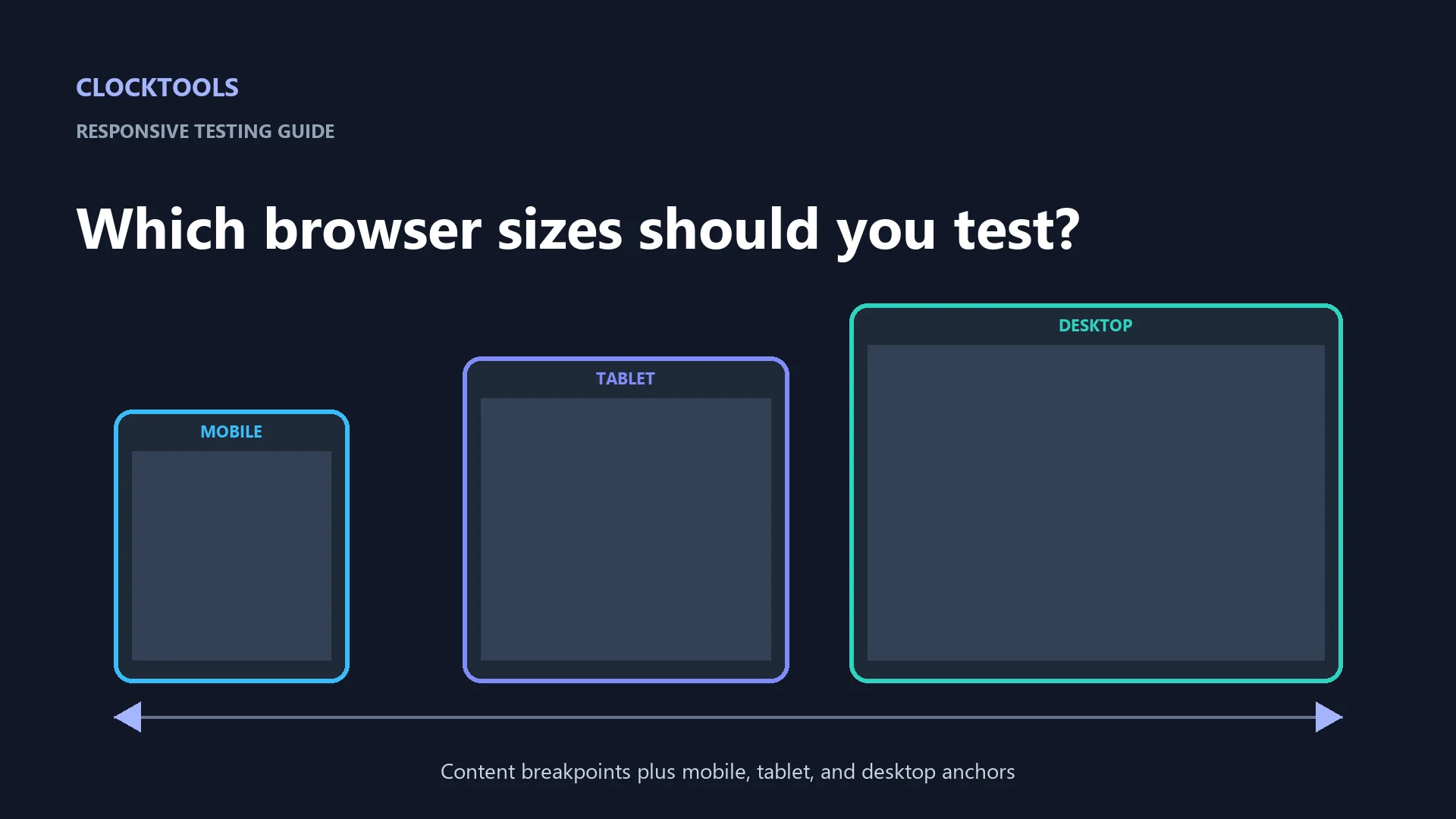
Table of contents
There is no permanent list of browser sizes that guarantees responsive design. Start with narrow, middle, and wide anchors—such as 390, 820, and 1440 CSS pixels—then test immediately below and above every breakpoint where your own content changes. The best breakpoint is where the layout starts to fail, not where a particular phone model happens to end.
The ClockTools Website Rendering Test can capture a public page at mobile, tablet, and desktop anchors while checking page metadata. Use it for a fast visual sweep, then interact with the page in browser developer tools and on representative real devices before release.
Why are three screenshots not three devices?
A CSS viewport is the area available to web content, measured in CSS pixels. It is not simply the physical pixel count printed on a device specification. Zoom, device-pixel ratio, browser controls, split-screen windows, scrollbars, and orientation can all change the available viewport.
That is why a “top phone sizes” checklist goes stale. MDN's responsive design guide recommends layouts that respond across the available range, while its media query fundamentals advise adding a breakpoint where the content begins to break rather than targeting every device.
Three screenshots still have value. They are fast anchors that expose large differences in navigation, columns, tables, and typography. Treat them as the first pass in a range, not as proof that all widths work.
What does each ClockTools viewport reveal?
The live ClockTools tool offers three independently selectable captures:
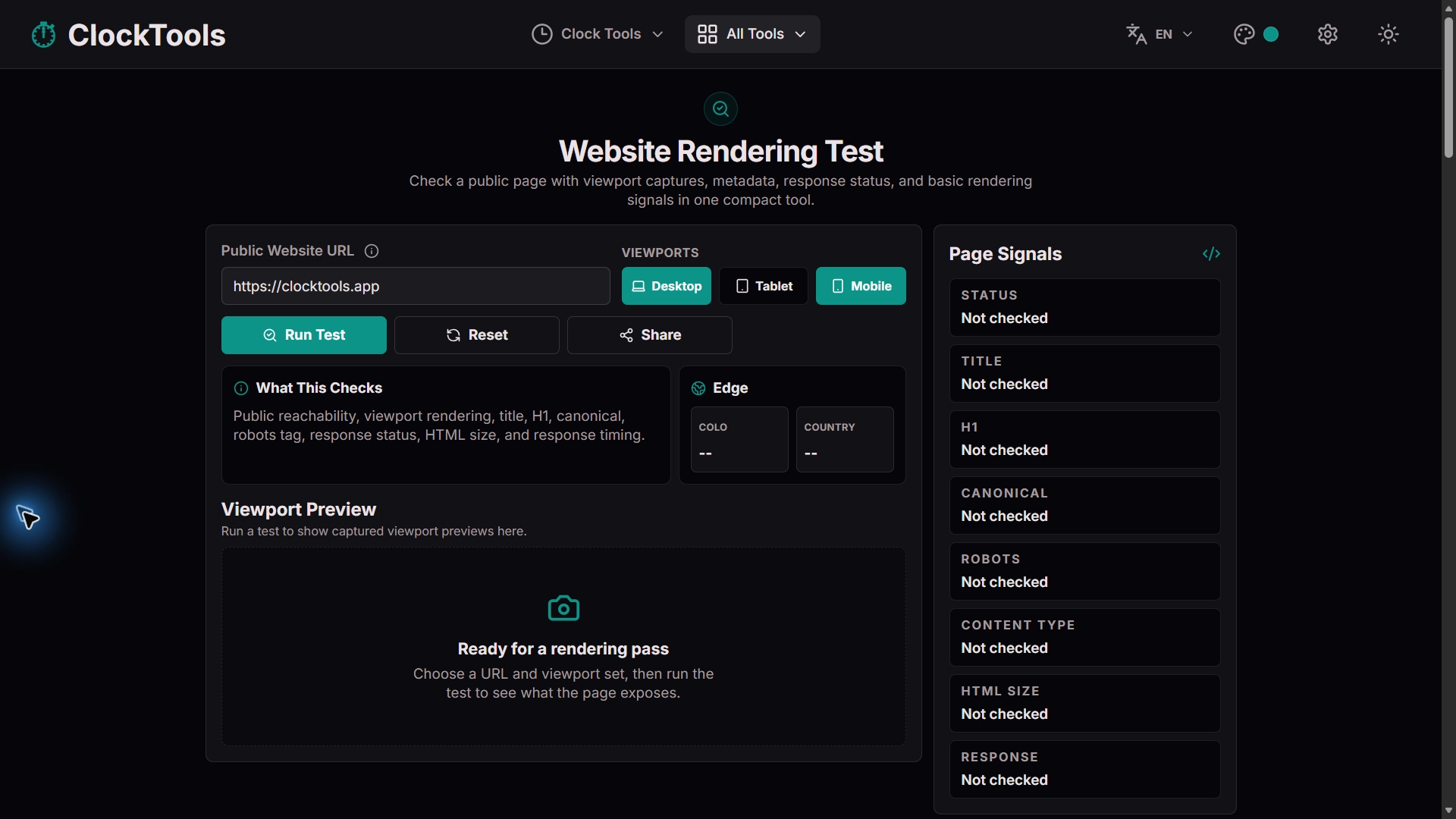
| Preset | Viewport | Best first questions |
|---|---|---|
| Mobile | 390 x 844 | Does one-column flow work? Do labels, menus, and tables fit? |
| Tablet | 820 x 1180 | Do grids collapse cleanly? Is the intermediate state intentional? |
| Desktop | 1440 x 900 | Are line lengths controlled? Do sidebars and wide navigation align? |
The result also reports the response status, title, H1, canonical URL, robots value, HTML size, and response timing. That pairing is useful because a beautiful screenshot of a redirected, blocked, noindex, or incorrectly canonicalized page is still a failed release check.
The renderer accepts public HTTP or HTTPS pages. It deliberately rejects localhost, private IP addresses, and internal network pages because the capture request runs outside your device. Do not submit signed preview links, passwords, tokens, or confidential staging URLs.
How do you build a breakpoint sweep?
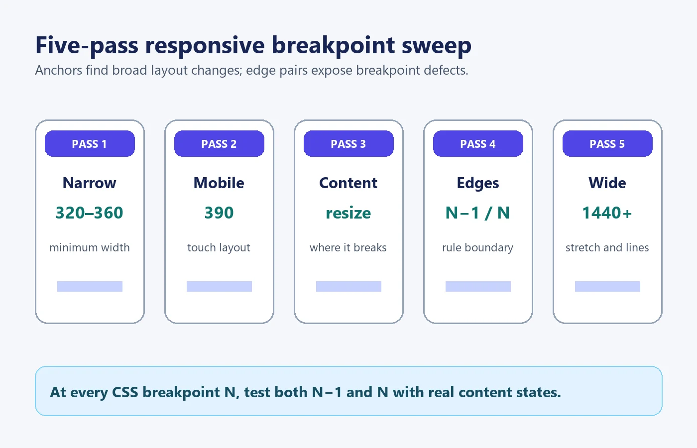
Use five passes instead of collecting a huge device matrix:
- Start narrow at 320 or 360 pixels to expose minimum-width assumptions.
- Capture a common mobile anchor such as 390 pixels and test portrait interaction.
- Move slowly wider until the content itself asks for a layout change; record that width.
- Test one pixel below and one pixel above each declared breakpoint, then repeat with long labels, validation errors, and expanded menus.
- Finish at a wide desktop anchor such as 1440 pixels and one wider window to catch uncontrolled line length or stretched media.
For a stylesheet that changes at 768 pixels, the high-value pair is 767 and 768—not only a generic tablet preset. If another grid changes at 1024, add 1023 and 1024. The edge pair reveals off-by-one gaps and overlapping min/max rules.
Include height when a sticky header, modal, consent banner, or on-screen keyboard can consume vertical space. Rotate at least one touch device or simulator. A layout that fits 390 x 844 may still fail at the same width with much less available height.
Which responsive failures should you fix first?
Prioritize by whether the user can complete the page's main task:
| Severity | Example | Release decision |
|---|---|---|
| Blocking | Submit button is off-screen, menu cannot open, horizontal scroll hides required fields | Stop the release |
| Major | Text overlaps, focus is clipped, table columns become unreadable | Fix before release |
| Moderate | Awkward wrapping, excessive empty space, secondary image crop | Fix or record deliberately |
| Cosmetic | Small alignment difference with no task impact | Schedule without masking higher risks |
The WCAG reflow understanding document explains why content should reflow without two-dimensional scrolling at narrow widths, with limited exceptions for content such as maps or data tables that genuinely require two dimensions.
Test real content states. Replace short placeholders with the longest supported label, show errors under fields, open navigation, expand accordions, and load the largest realistic table row. Responsive failures often appear after interaction, not in the clean initial screenshot.
When do you need a real device?
Use real hardware when success depends on touch, an on-screen keyboard, safe-area insets, camera or location permission, audio, rotation, reduced-motion settings, mobile browser controls, or performance on a constrained device. A headless capture cannot reproduce every input method and operating-system behavior.
Also run the page with browser zoom and text enlargement. A layout can fit its nominal viewport and still clip when text grows. The real-time HTML editor is useful for isolating a CSS experiment, while the text diff checker can confirm exactly which responsive-rule edits changed between two versions.
The practical release record is a small matrix: tested width and height, content state, browser or engine, observed problem, and result after the fix. That evidence is more durable than a screenshot folder named only after device brands.
Frequently Asked Questions
Are 320, 768, and 1440 pixels enough for responsive testing?
They are useful anchors, not complete coverage. Test just below and above every layout breakpoint, plus widths where your content begins to overflow or controls become hard to use.
Should CSS breakpoints match popular phone models?
Usually no. Choose breakpoints where the content or interaction needs a different layout. Device presets are valuable samples, but a model list becomes stale and leaves gaps.
What is the difference between screen width and viewport width?
Screen width describes the display, while viewport width describes the CSS-pixel area available to the page. Browser chrome, split view, zoom, and device scaling can make them differ.
Can a screenshot prove that a responsive page works?
No. A screenshot can expose clipping and composition problems, but keyboard access, focus, menus, forms, orientation changes, loading, and dynamic content require interaction tests.
Why should I test one pixel on both sides of a breakpoint?
Those paired checks reveal sudden overflow, disappearing controls, or contradictory min-width and max-width rules exactly where the layout changes.

About The Author
Vigneshwaran Vijayakumar
Founder, Developer and Publisher of ClockTools | Digital Marketing Manager | India
Vigneshwaran is an engineer with decades of technical experience, including professional work as a Digital Marketing Manager in Dubai. His work connects data analysis, search engine optimization, conversion-rate optimization, content systems, visual production, and applied AI and machine learning. At ClockTools, he turns that multidisciplinary experience into focused browser utilities and practical, source-aware guides.