Inspect public page metadata and static, no-JavaScript HTML, CSS and image previews at desktop, tablet and mobile viewport sizes.
How to use
Inspect public page metadata and static, no-JavaScript HTML, CSS and image previews at desktop, tablet and mobile viewport sizes.
Step 1
Enter a public page
Illustrative example, not a live resulthttps://clocktools.app/
Use a public HTTPS page for a static preview; HTTP supports metadata only. Do not include credentials, custom ports, signed links or personal identifiers.
Step 2
Choose viewport sizes
Illustrative example, not a live result1440×900 · 820×1180 · 390×844
Select desktop, tablet or mobile. These are CSS viewport sizes, not named physical devices or a cross-browser test matrix.
Step 3
Inspect the actual evidence
Illustrative example, not a live resultPNG · JSON
Read capture status before inspecting a picture. Download PNG only when a real capture succeeds; export metadata separately.
Practical uses
Responsive release review
Before releasing a public article template, select desktop and mobile, then add tablet if its intermediate layout matters. Compare headline wrapping, navigation, images and visible content at those exact widths. Save successful PNGs and the JSON report with the release ticket. Test menus, forms and JavaScript-created content separately in a normal browser before approving the template.
Metadata handover
During a page migration, inspect the fetched title, first H1, canonical and robots value alongside the final URL and status. Export the metadata even when a preview is unavailable. A canonical pointing elsewhere is a configuration clue to investigate, not proof of a search engine’s selection. Confirm intended source markup and deployment rather than judging SEO from a screenshot.
Failure investigation
If a public page looks blank or unstyled in the preview, read capture and omitted-resource notices first. Compare the page locally with JavaScript disabled, then with normal execution. This can distinguish a dynamic shell from missing CSS or images. A failed capture and a successful capture of sparse HTML are different outcomes and should lead to different bug reports.
Source HTML
Viewport capture
Separate conclusions
Metadata is extracted from the fetched HTML. A successful screenshot records a viewport at one moment; neither path certifies interactions or every device.
Background and engineering
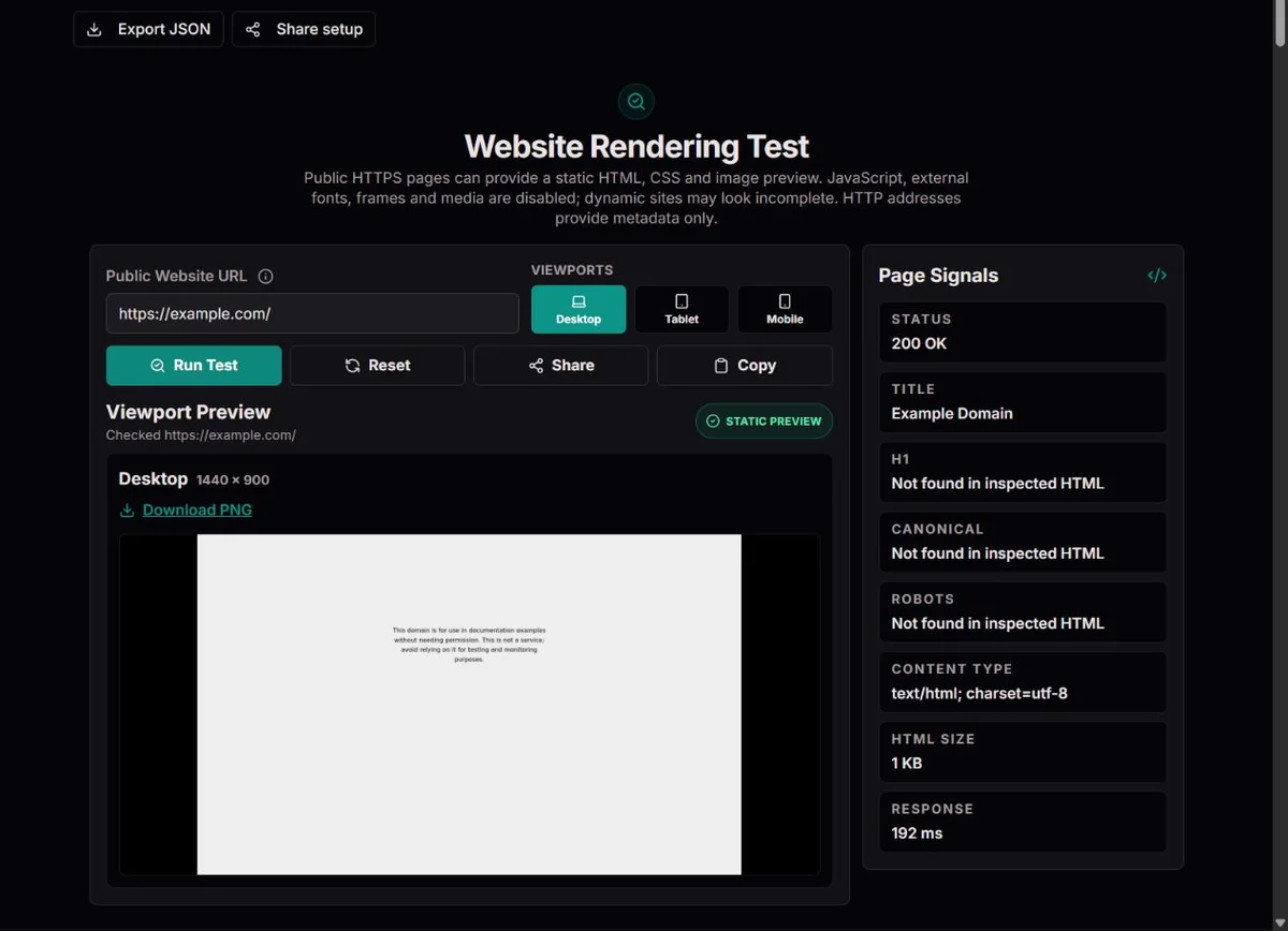
The example.com desktop capture shows the fetched page with JavaScript disabled, alongside its response and metadata. It is a static view, not an interactive or cross-browser test.
From fixed pages to viewport-driven layouts
CSS media queries allow a stylesheet to respond to viewport conditions. Their pixel units refer to CSS pixels, not the physical pixel count printed on a phone specification. Testing 390 pixels wide is therefore not the same as certifying a particular phone.
A page can pass at the selected widths and still overflow between them. Inspect long text, orientation changes, zoom and actual interaction separately. A first-viewport picture cannot confirm content below the fold or a checkout journey. W3C media-query specification.
An image and an HTML response answer different questions
A static preview paints fetched HTML, CSS and supported images without JavaScript. Metadata is extracted separately from bounded source HTML; neither result establishes a JavaScript-generated DOM.
Only validated public HTTPS resources are eligible for the preview. Scripts, external fonts, frames, media and connections are disabled. Missing or blocked assets can change appearance; a valid PNG can still show an incomplete or blank dynamic site. Browser request guardrails.
Worked example: status 200 with no screenshot
Illustrative example: a page returns HTTP 200 and a title, but no preview is available. This establishes a source response, not a painted interface. Check the specific failure; HTTP pages, unsupported content and capture limits can leave metadata only.
HTTP response
200
Evidence obtained
Source metadata
Not established
Rendered appearance or successful interaction
Choose widths to answer a layout question
The available selections are desktop 1440 × 900, tablet 820 × 1180 and mobile 390 × 844. Desktop and mobile are the default pair; select tablet when you need the middle-width comparison. At least one size stays selected. These are fixed viewport settings, not a device catalogue, and this page offers no custom width, orientation, browser family or touch-emulation control.
Check a specific public HTTPS path rather than only the homepage. A long article, product listing or translated page can stress a template differently. Run the same path at all relevant sizes and note which content is visible in the initial viewport. The W3C media-query specification describes width-dependent CSS conditions; the practical question here is whether that page’s static layout stays usable at each selected width.
For a fixed example, desktop shows a title on one line while mobile needs three. That change is not automatically a defect. Look for clipped words, content covering another element or a main action pushed outside the visible area without a useful continuation. Check widths between the presets, text zoom and orientation in your own browser too. Passing three samples does not establish that every breakpoint or physical device works.
Settings and the questions they help answer
Viewport
Useful review
Not established
1440 × 900
Wide navigation, columns and headline wrapping
Every desktop screen, browser or zoom level
820 × 1180
Intermediate column and navigation transitions
A named tablet or touch behavior
390 × 844
Narrow text, image sizing and initial content
A named phone, keyboard behavior or all mobile widths
Understand what is actually drawn
The preview draws fetched source HTML, supported CSS and images with JavaScript disabled. A server-rendered heading can therefore appear while a client-generated chart does not. The capture is the first viewport, not a full-page image; content below it has not been visually inspected. A valid PNG proves that a static capture was produced at the selected dimensions, not that the normal interactive page finished loading.
External fonts, frames and media are excluded. A fallback font can change word widths, line breaks and element height. An icon supplied by an external font may disappear while an ordinary image remains. If the report notes omitted resources, treat the picture as partial and identify which visible difference could follow from those omissions before changing your site’s spacing.
This boundary is useful when you want to see what the initial HTML contributes. In a fixed comparison, a server-rendered article retains its text without JavaScript, while an application that sends only a root container can look sparse even with HTTP 200 and a title. Neither result alone evaluates progressive enhancement or availability for all visitors. Compare your own source response and normal browser behavior to decide whether the missing content is intentional.
Interpret source metadata without turning it into a score
Metadata is extracted separately from the fetched HTML, not from a JavaScript-modified DOM or from pixels in the screenshot. The visible Page Signals rows show the response status, title, first H1, canonical, robots, content type, inspected HTML size and approximate response time. The JSON export also retains the extracted description and viewport value, final URL and redirect evidence; description and viewport do not have separate visible rows. Use those extra fields when comparing page configuration with a capture problem, without treating either report as a search-engine verdict.
A missing or empty field is not proof that equivalent markup is absent from the full page. The HTML parser reads attributes by name, so changing their order does not prevent extraction; ordinary quoted and unquoted attributes are supported. Inspection is bounded, however, and truncation can leave later tags outside the inspected source. The first H1 is reported, not the whole heading outline, and JavaScript-generated content is not examined. If parsing fails, the result reports unavailable metadata and a failed capture, rather than confirming absent tags. Compare the anonymous page source with your browser’s modified DOM before adding duplicate tags as a speculative fix.
The HTML canonical relation identifies a preferred URL for the document. Verify that the reported value matches your intended page rather than an old environment or unrelated path; the tool does not establish which URL a search engine will select. Similarly, Google’s robots documentation explains crawler directives, but a displayed robots meta value is not a crawl or indexing verdict. HTTP header directives and other discovery conditions need separate inspection.
A familiar title with a login page or challenge screenshot is a warning to compare the anonymous response, not evidence of successful authenticated rendering. Metadata and capture are separate requests and can encounter different content, cache states or deployment moments. Keep their statuses together rather than using one to fill in missing evidence from the other.
Separate metadata-only, partial and successful results
Read each viewport’s outcome independently. One successful picture does not turn a failed mobile capture into a pass. A metadata-only result can still provide useful response and source fields, but it contains no visual evidence for the unavailable viewport. HTTP targets support metadata only; use the actual public HTTPS address when a static preview is required, without assuming an HTTP redirect upgrades that capability.
If metadata fetching fails, resolve that error first. For a preview failure, check the specific message: a non-successful source response, unsupported content, redirect problem or request, byte or time limit can prevent acceptance. A PDF or JSON endpoint is not an HTML layout test. Do not describe all such outcomes as blank pages; no accepted screenshot is fundamentally different from a screenshot whose content is blank.
For a successful but partial image, compare omitted-resource information and visible symptoms. Unstyled text suggests checking the stylesheet path and supported content type; missing pictures suggest checking image delivery; sparse application content suggests dependence on JavaScript. These are investigation leads, not diagnoses made by the tool. Only change your own site after reproducing the relevant condition with its actual source and resource requests.
Evidence to retain in a rendering ticket
Result
What you can say
What to retain
Metadata only
Source information was available, no accepted preview for this size
Status, final URL, source fields and capture error
Accepted static PNG
A static initial viewport was captured
Size, time, PNG and any omitted-resource notice
Sparse or blank accepted PNG
The captured static document showed little visible content
Source HTML comparison and JavaScript-disabled local test
One viewport failed
Coverage is incomplete
Per-size outcomes, not only the successful picture
Make a useful review package
Keep the target path, selected sizes, observation time, metadata and per-viewport outcomes in the JSON report. Download a PNG only from a successful capture. These files answer different questions: the image records appearance, while JSON provides context and failures that are easy to lose in a cropped picture. Do not use a screenshot filename alone as evidence of the page, time or conditions tested.
For a layout defect, describe the affected element, width and visible consequence: for example, a long product name clips at 390 pixels while remaining readable at 820. Give the maintainer the public path and say whether omitted resources or JavaScript absence could explain the appearance. A reproducible statement is more actionable than “mobile failed,” especially when the test itself completed successfully.
Finish the review locally: use keyboard navigation, activate menus, submit authorized test forms and inspect loading or error states. Check the actual supported browsers and devices for the project. This static tool does not measure accessibility, Core Web Vitals, interaction latency or a full device matrix. Cancel or reset when changing the input; sharing prepares another deliberate test and does not freeze the original page or result.
Methodology
We check the page metadata and its static appearance separately, without signing in or supplying private credentials. Each accepted preview matches the selected viewport dimensions. When a preview or an asset cannot be included, we show that limitation instead of treating the metadata as proof of a complete page render.
Limits
This shows the initial viewport, not a full JavaScript render, a whole-page capture, a performance score or an accessibility audit. External fonts, frames, media and dynamically loaded content may be absent, so the appearance can differ from your browser. Use public pages only and check interactive behaviour on your own devices. Cancelling a run prevents its late result from replacing your current view.
Corrections
Report a reproducible problem with the page URL, safe input, checked-at time, expected result and source evidence through the Contact page. Include the public source response when possible, without account details or secret links. A changed source record is not necessarily a calculation error. Compare the same name, page and observation time before requesting a correction.
HTTP targets, unsupported content, a source error or a capture limit can produce metadata without an accepted static image. Read the specific per-viewport notice. A title and HTTP response do not prove that a page was drawn, and a missing capture is not a diagnosis that the website itself is blank.
Does the test execute JavaScript?
No. It draws fetched HTML, supported CSS and images without page JavaScript. Client-created widgets, routes and content can be missing. Compare a normal browser and a JavaScript-disabled local view when that difference matters; a successful static image is not a successful interactive-application test.
Are the presets real phone and tablet emulations?
No. They set fixed viewport dimensions: 1440 × 900, 820 × 1180 and 390 × 844. They do not establish touch input, device pixel ratio, operating-system behavior or a browser-family comparison. Use your own responsive and physical-device tests for those additional conditions.
Why do fonts or icons look different?
External fonts are excluded, so fallback font metrics can change wrapping and spacing, and font-based icons can be absent. Frames, media and some dynamically loaded resources are also unavailable. Read omitted-resource information before treating the difference as a CSS defect in your site.
Does HTTP 200 mean the whole page passed?
No. It describes a successful HTTP response, not every resource or interaction. A JavaScript application shell can return 200 and still show little static content. Review the per-size capture and resource notices, then test the actual page’s behavior in your own browser.
Why is a title or canonical missing when I can see it in my browser?
The value may be inserted by JavaScript, absent from the anonymous source or not matched by the limited extractor. Truncated HTML can also omit later markup. Compare source HTML, not only the live DOM, and verify the intended tag before changing the page or adding another copy.
Does the PNG include the entire page?
No. It records the initial viewport at the selected size. Content below that area, scrolling, lazy loading and fixed elements after scrolling require separate review. A download is a useful snapshot of the visible area, not proof that every section was inspected.
Can I test a private dashboard or signed preview link?
No. Use ordinary public pages without credentials, account identifiers or secret tokens. The test is anonymous and does not carry your browser login. Review private pages locally with your organization’s authorized tools instead of putting their access links into a public checker.
Can the metadata tell me whether a page is indexed or accessible?
No. Extracted source fields do not establish indexing, a crawler’s canonical selection or accessibility. Review the relevant crawler tools, source and header directives for indexing, and use a separate accessibility evaluation with keyboard and assistive-technology checks. A visually tidy static picture cannot answer those questions.