Halloween Typography
How Do You Make Halloween Text Readable on a Poster?
Use a short headline, strong contrast, one clear reading order, and line breaks designed for the export ratio. See a measured audit of all four ClockTools palettes.
By Vigneshwaran Vijayakumar, Developer and Publisher | | Reviewed under the ClockTools editorial policy
Table of contents
A readable Halloween poster gives the eye one clear path: headline first, essential detail second, decoration last. Keep the headline short, use a strong light–dark contrast, and judge the exported image at the size where people will actually see it. A spooky type treatment can set the mood, but it should never force someone to decode the date, time, or action.
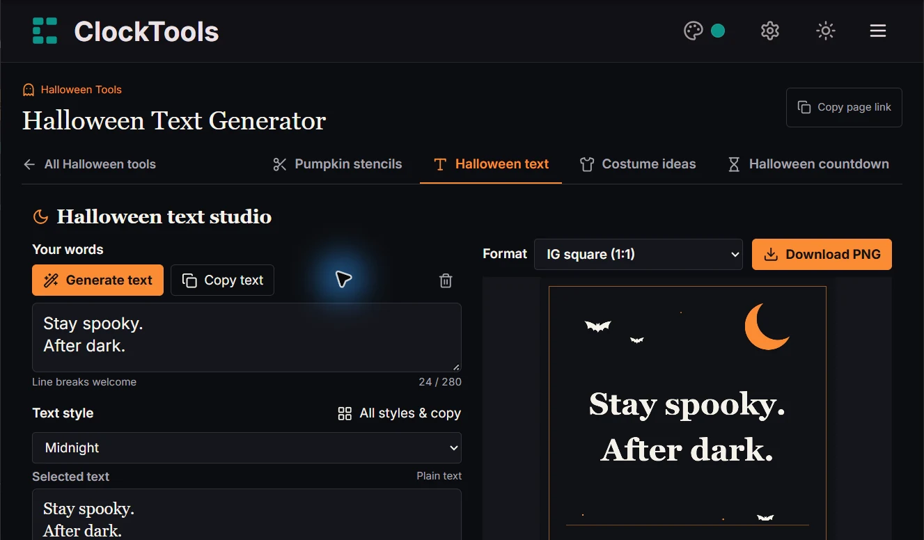
The practical order inside the ClockTools Halloween Text Generator is: choose the destination format, write the shortest useful headline, set the line breaks, select a palette and background, then inspect the exported PNG at normal viewing size. Keep a plain-text copy of the event details outside the image as well.
Can a stranger read the poster in three seconds?
The “three-second test” is an editing check, not a scientific threshold. Show the poster at its likely viewing size and ask what a first-time viewer notices immediately. The answer should be the event or message—not a texture, a bat, or the name of a font.
Use this reading order:
- Message: “TRICK OR TREAT AT MOONRISE.”
- Action or time: “31 OCT · 18:00.”
- Decoration: moon, bats, cobwebs, or another scene that supports the first two layers.
If the decoration wins, simplify it. If the headline and the details compete, make the headline larger and move details into plain text. If the phrase cannot be read at thumbnail size, shorten it before shrinking the letters.
This quick test also exposes false confidence from a large desktop preview. A design can look generous at 100% and become cramped in a phone feed. Review the actual exported PNG, not only the editor canvas.
What does the ClockTools generator let you control?
A controlled review of the live tool found two deliberately separate jobs. The main area produces eight copyable text styles from your own phrase or one of 48 local captions. Poster Studio produces an image with three poster fonts, four palettes, seven backgrounds, three alignments, six export formats, and an adjustable title size.
That separation matters. A Unicode or framed text style is useful for a caption that will remain selectable text. It is not automatically the best choice for an image headline. The poster controls use a smaller type system so the preview and downloaded PNG can be laid out predictably.
The six image canvases are fixed rather than vague labels:
| Format | Canvas | Shape to plan for |
|---|---|---|
| IG square | 1080 × 1080 | Equal width and height |
| IG portrait | 1080 × 1350 | Moderate vertical space |
| IG tall | 1080 × 1440 | Taller feed image |
| IG story | 1080 × 1920 | Narrow, full-screen vertical composition |
| 1000 × 1500 | 2:3 vertical composition | |
| Landscape | 1920 × 1080 | Wide horizontal composition |
Changing the format changes the canvas, not the words. That is why format choice belongs before fine-tuning line breaks.
How much contrast do the built-in palettes provide?
Contrast is a light–dark relationship, not a judgment that one hue is inherently readable. The W3C explanation of text contrast uses 4.5:1 for normal text and 3:1 for large text as WCAG 2.2 Level AA thresholds. It also warns that thin or unusual letterforms can appear weaker than their nominal colors suggest.
The following is an original audit of the four ClockTools poster palettes. The ratios were calculated from each built-in foreground and background hexadecimal color using the WCAG relative-luminance formula. They describe the base text/background pair; they do not certify every crop, decorative element, device, or downstream edit.
| Palette | Foreground | Background | Calculated ratio |
|---|---|---|---|
| Ember | #f5f2eb | #101115 | 16.88:1 |
| Violet | #f5f2eb | #19141f | 16.18:1 |
| Bone | #19141f | #f5f2eb | 16.18:1 |
| Potion | #f5f2eb | #101916 | 16.02:1 |
All four base pairs are comfortably above those numeric thresholds. Still inspect the letters at export size. Glow, texture, illustration, compression, display brightness, and a thin font can change the practical reading experience. Treat the ratio as a strong starting point, not a substitute for looking.
Where should decorative lettering stop?
Use the most theatrical treatment on the fewest important words. A useful division is:
- Headline: one decorative face is acceptable when the letter shapes remain familiar.
- Date, time, place, and instruction: use the clearest available face and conventional capitalization.
- Message accompanying the image: repeat critical details as real text so recipients can copy, translate, zoom, or hear them with assistive technology.
Penn State’s poster-design guidance recommends consistency, a small font set, and type that remains readable from a distance. That principle applies even to a playful social graphic: a second effect should clarify hierarchy, not compete for attention.
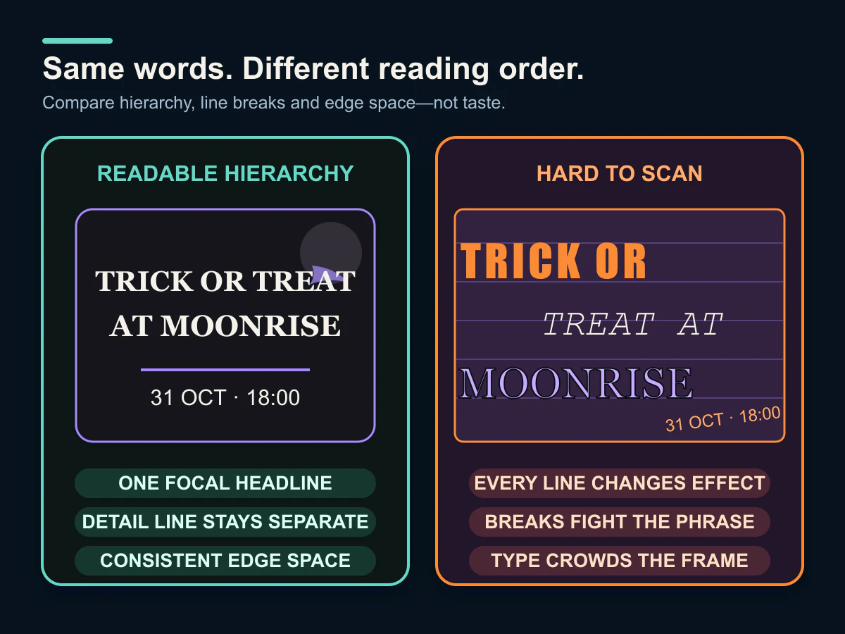
The comparison is intentionally about decisions, not taste. The readable side reserves decoration for the headline, keeps the detail line separate, and leaves a clear edge margin. The difficult side makes every line shout in a different way. No arrows are needed because the two labelled panels provide a direct, one-to-one comparison.
Which line breaks survive the export ratio?
Write line breaks for the chosen canvas rather than forcing one composition into all six formats. A landscape image often supports two balanced lines. A story image can support more vertical separation, but a long single line becomes small or touches the sides.
Start with the smallest meaningful unit:
TRICK OR TREAT
AT MOONRISE
Then inspect it in the intended format. Break at a phrase boundary, not in the middle of a name, date, or instruction. Avoid a final line containing one weak word unless that word is the deliberate focal point.
The U.S. Web Design System’s typography guidance explains why controlled line length and sufficient line spacing help the eye move between lines. A poster headline is shorter than body copy, but the same visual principle holds: the reader should not have to search for where the next line begins.
How should you use an illustrated background?
Choose a background after the message and hierarchy are stable. The seven ClockTools options range from illustrated scenes such as Moon & bats and Haunted house to Plain. Plain is the most useful diagnostic state because it reveals whether the type works without decorative help.
When you add a scene, ask three specific questions:
- Does any bright illustration sit directly behind a letter?
- Does the focal illustration pull the eye away from the headline?
- Does the composition still work when cropped or shown as a small preview?
If the answer is no longer clear, return to Plain, shorten the text, or choose a simpler scene. Do not solve every collision by shrinking the headline. Size is part of the message hierarchy.
What should you check before downloading the poster?
Use a release check that follows the actual image:
- Read every word once at full resolution and once at likely feed size.
- Verify spelling, date, time, and capitalization in the source text.
- Confirm the selected canvas matches the destination.
- Check all four edges for cramped letters or important details.
- Make sure the first line is visibly more important than the supporting line.
- Inspect contrast on the real background, not just in a palette swatch.
- Keep private addresses and personal contact details out of a public graphic.
- Download the PNG, reopen it, and confirm that the export matches the preview.
If the poster announces a timed event, use the Halloween Countdown Timer to check the target date and named time zone separately. A countdown can verify timing, but it cannot repair an ambiguous poster label.
A repeatable Halloween-poster recipe
Here is a compact sequence for a two-line event graphic:
- Draft the complete event information in the ClockTools Online Notepad, then identify the five to eight words that belong in the headline.
- Open the Halloween Text Generator and choose the final image format.
- Enter the short headline and add one phrase-boundary line break.
- Begin with the Plain background and a high-contrast palette.
- Choose one readable poster font, then adjust size and alignment.
- Add one illustrated background only if it preserves the reading order.
- Export the PNG and repeat the three-second test at actual viewing size.
- Place the date, time, location, and accessibility information in ordinary text beside the image.
The goal is not to remove the Halloween character. It is to make the character support the message. When the words survive the thumbnail, the background, and the export ratio, the poster can be both spooky and immediately useful.
Frequently Asked Questions
What makes Halloween text hard to read?
Common causes are weak light–dark contrast, unfamiliar letter shapes, too many type effects, long unbroken lines, text placed over detailed artwork, and type that becomes too small in the final format.
Should every line use a spooky font?
No. Reserve the most decorative treatment for a short headline. Keep dates, times, locations, and instructions in the clearest available style, and repeat essential information as ordinary text beside the image.
Which ClockTools poster palette has the highest base contrast?
In the audited built-in color pairs, Ember measured 16.88:1 between its foreground and background. Violet and Bone each measured 16.18:1, and Potion measured 16.02:1. Practical readability still needs visual inspection.
Should I choose the poster format before writing line breaks?
Yes. A wide landscape canvas and a narrow story canvas distribute the same phrase differently. Choose the destination format first, then break lines at natural phrase boundaries and inspect the actual export.
Can a contrast ratio guarantee that a poster is readable?
No. A ratio checks the base foreground and background colors. Font shape, stroke weight, glow, texture, illustration, compression, size, and viewing conditions can still make text difficult to read.
What information should stay outside a Halloween poster image?
Repeat critical event details, accessibility information, and any action the reader must take as ordinary text. Keep private addresses and personal contact information out of publicly shared graphics.

About The Author
Vigneshwaran Vijayakumar
Founder, Developer and Publisher of ClockTools | Digital Marketing Manager | India
Vigneshwaran is an engineer with decades of technical experience, including professional work as a Digital Marketing Manager in Dubai. His work connects data analysis, search engine optimization, conversion-rate optimization, content systems, visual production, and applied AI and machine learning. At ClockTools, he turns that multidisciplinary experience into focused browser utilities and practical, source-aware guides.